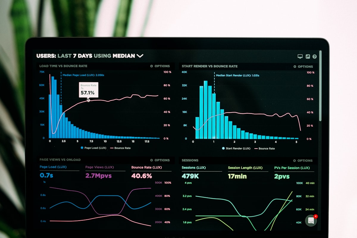
Technical analysis divides the trading community — devotees see it as a reliable edge, critics call it chart-reading superstition. The truth is nuanced: TA works because enough market participants believe it works, creating self-fulfilling patterns at key levels. Understanding the major indicators won't guarantee profits, but it will help you understand the language traders use and avoid obvious buying-at-the-top mistakes.
Reading candlestick charts
Every candle on a price chart represents one time period (1 minute, 1 hour, 1 day, etc.) and shows four prices: Open (price at period start), High (highest price reached), Low (lowest price reached), and Close (price at period end). Green (bullish) candles close higher than they opened. Red (bearish) candles close lower. The "body" is the thick part between open and close. The "wicks" are the thin lines above and below showing the high and low extremes.
Key patterns: a "Doji" (open = close, long wicks both directions) signals indecision. A "Hammer" (small body, long lower wick) at the bottom of a downtrend signals a potential reversal. An "Engulfing" pattern (one candle completely covers the previous candle's body) often signals a reversal. These patterns are more reliable on higher timeframes (daily/weekly) than on lower ones (1-minute).
RSI: overbought and oversold
The Relative Strength Index, developed by J. Welles Wilder, measures the speed and magnitude of recent price changes on a 0–100 scale. RSI above 70 means the asset has risen rapidly and may be "overbought" — due for a pullback. RSI below 30 means it's fallen rapidly and may be "oversold" — due for a bounce. The 14-period RSI is the standard setting. Important caveat: in strong uptrends, RSI can remain overbought for weeks. In strong downtrends, it can stay oversold. Always use RSI as context, not a standalone signal.
"Divergence" is RSI's most powerful signal: when price makes a new high but RSI makes a lower high, it's "bearish divergence" — momentum is weakening before the price shows it. This setup preceded many of crypto's largest corrections, including the late 2021 peak.
MACD: trend and momentum
MACD (Moving Average Convergence Divergence) shows the relationship between two exponential moving averages — the 12-period EMA minus the 26-period EMA. A 9-period EMA of this result (the "signal line") is plotted alongside it. When MACD crosses above the signal line, it's a bullish signal. When it crosses below, bearish. The histogram shows the gap between MACD and the signal line — when bars are growing, momentum is building; when shrinking, momentum is fading.
Support, resistance and Fibonacci
Support levels are price zones where buying has historically exceeded selling, causing price to bounce. Resistance levels are the opposite — zones where selling has exceeded buying, causing price to reject. These levels come from previous highs, lows, and high-volume traded price zones visible on a chart. Once a resistance level is broken, it often becomes support (and vice versa) — this is called a "flip."
Fibonacci retracement levels (23.6%, 38.2%, 61.8%, 78.6%) mark potential support zones during pullbacks. The 61.8% level ("the golden ratio") is particularly watched. After a major move up, traders watch whether price holds the 61.8% retracement level as support. On Bitcoin, major bottoms have repeatedly occurred near 0.618 Fibonacci retracement levels.
RSI levels and their trading implications
| RSI level | Signal | What it means | Action |
|---|---|---|---|
| 0 – 30 | Oversold | Sharp recent decline, may bounce | Watch for reversal signals |
| 30 – 50 | Bearish neutral | Below midpoint, slight downward bias | Caution on longs |
| 50 – 70 | Bullish neutral | Above midpoint, upward bias | Trend-following setups |
| 70 – 100 | Overbought | Sharp recent rise, may pull back | Tighten stops, reduce size |